AT&T Build-A-Plan · 2025

Designing AT&T's first fully customizable, digital-only phone plan to attract 86M new customers.

Entering the low-cost wireless space quickly, and with a tone and visual identity built for a younger, digital-native audience.

Abstract building blocks representing the Build-A-Plan concept
Role
Senior Content Designer
Team
1 content designer, 3 designers, 1 researcher
Timeline
January 2025 – August 2025
Overview

A fully customizable wireless experience where customers control what they pay for.

AT&T customers didn't have a low-cost phone plan that let them pay only for the features they wanted. In fact, AT&T was the least-considered brand for price-sensitive customers. As competitors backed offerings like Mint Mobile and Visible, we needed to enter the space. 

And we needed to do it quickly.

Leadership didn't just want us to design a new phone plan. They wanted an experience with its own tone and visual identity that a younger, more tech-savvy audience would latch onto: new imagery, new color guidelines, and potentially, a new voice.

Solution: AT&T Build-A-Plan—a fully customizable wireless experience that lets customers control what they pay for. Customers get an affordable phone plan with the flexibility to add or remove features as their needs evolve — putting customer control directly in their hands instead of locking them into a one-size-fits-all approach.

Objectives

What we set out to do.

  • Reduce cost to serve by designing a digital-only sub-brand

  • Grow market share with price-sensitive customers

  • Attract customers in a segment AT&T traditionally considers under-penetrated

  • Establish a tone and visual identity that would appeal to a younger audience

TARGET AUDIENCE

Digital natives who want low-touch, frictionless experiences.

Because this product would be digital-only, we focused on designing for customers who prefer to handle everything online and are comfortable navigating self-service flows and support.

These customers are younger and less established. They're cost-conscious, shop around, and they expect personalization without having to shop in a brick-and-mortar retail store.

Role

What I owned, what the team did.

What I did
  • Designed the tone and voice activities for the design principles workshop for marketing and product management stakeholders
  • Partnered with the UX researcher to design a survey that refined workshop feedback into the final Build-A-Plan tone principles
  • Partnered with UX designers on product strategy and user flows
  • Content design and strategy for the landing page and prototype
  • Conducted A/B tests to refine tone, headlines, and other copy
Team contributions
  • Ran a workshop to establish Build-A-Plan design principles
  • Created a new visual identity for Build-A-Plan
  • A mix of moderated user research studies and customer surveys
  • Landing page and prototype
  • Concept testing
Approach

How I thought through it.

A look at how I used content design to keep the team's efforts customer-centric, usable, and aligned with AT&T's strategy and business goals.

  1. 01

    Study how other brands talk to younger audiences

    The tones AT&T and our wireless competitors use were clear, even for our competitors' new offerings. I wanted to look beyond telecom to companies seen as cool or trendy at the time (Apple, Nike, Spotify, and Duolingo) to give us a range of tones to dig through.

  2. 02

    Build the right playground for stakeholders

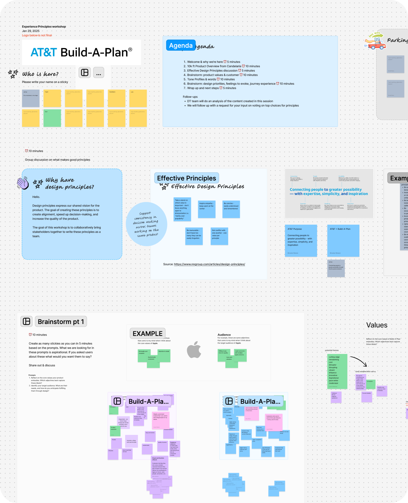
    Designing something that intentionally went against the grain of our usual branding was a balancing act. To start on the right foot, I designed workshop activities that helped stakeholders streamline their thinking and kept them in the right mindset throughout. This gave us clarity on Build-A-Plan's core values, target audience, the feelings the experience should evoke, and the tone profiles we should explore in concepting.

    Figjam workspace from the design principles workshop
    Figjam workspace for the design principles workshop
  3. 03

    Concept strategy with risk in mind

    As a digital-only offering, customers wouldn't be able to get help from retail store employees and might not be able to get support through usual phone channels. I worked with designers to lay out components and information so customers had everything they needed to make informed decisions and complete the flow without being overwhelmed or discouraged. We also double-checked the accessibility of copy, patterns, and colors, since they differed from what AT&T typically uses.

  4. 04

    Test the content, not just the design

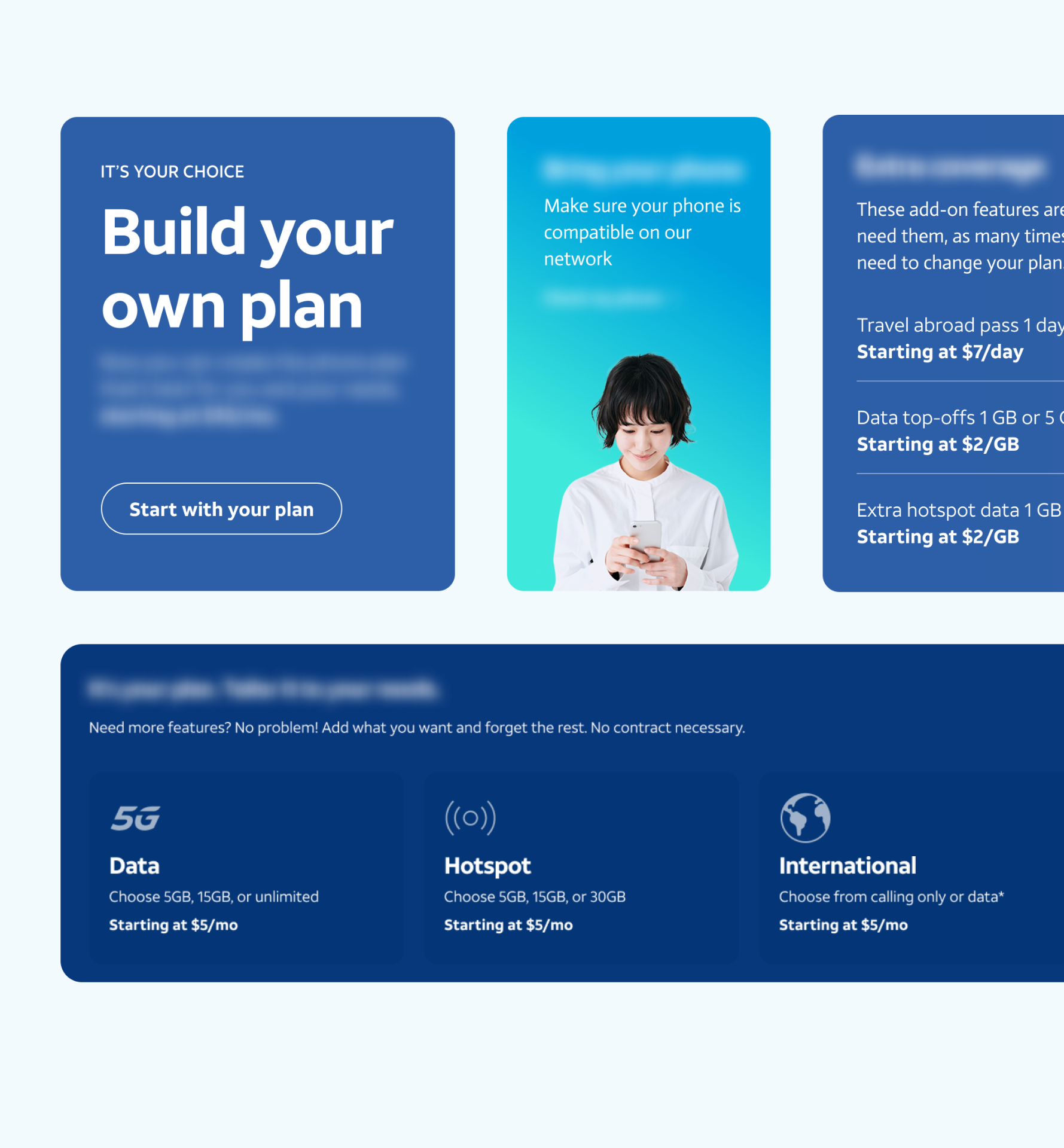
    With our design and tone principles set, I drafted multiple versions of copy for the landing page and prototype, then worked with our UX researcher to incorporate copy testing into our research studies. This helped us validate previous findings and narrow in on the concept we'd move forward with.

    Copy testing stimuli for the Build-A-Plan landing page
    Copy variations tested with customers
Design & content principles

Five principles to hold the work to.

After the experience principles workshop, I used survey feedback to refine it down to these five. They shaped both content design and UX design throughout the homepage and prototype.

  1. 01

    Personalization & empowerment

    Empower customers with personalized, customizable experiences that acknowledge individual needs. Build-A-Plan® lets customers build a plan around what they actually use.
  2. 02

    Reliability & trustworthiness

    Provide dependable, trustworthy service. Our 18 – 34-year-old digital natives manage their lives on their devices. Because Build-A-Plan® is on the AT&T network, they can depend on the coverage.
  3. 03

    Value & affordability

    Cater to cost-conscious users by delivering value for money. Build-A-Plan® customers will shop around for the best deals that meet their needs.
  4. 04

    Enjoyment & intrigue

    Intrigue with a distinct, fun experience that is friendly, upbeat, and conversational — humor that's funny without being silly. Build-A-Plan® lives in digital channels, so it gets its own look and tone.
  5. 05

    Thoughtfulness

    Be considerate, laid-back, and approachable. Avoid stuffiness or passivity. No nonsense or gimmicks. Transparency that signals care for the customer.
Research

What we learned from customers.

Since the product's tone and voice were such a huge part of the ask, I led the design of the stimuli for content and copy-effectiveness testing. A few executives — inspired by the positive audience reaction to Ryan Reynolds' casual, wry brand of humor in Mint Mobile commercials — wanted Build-A-Plan copy to sound like “AT&T’s emo younger cousin.”  I had a hunch the target audience wouldn't necessarily latch onto this, but we put it (and a few other options) to the test to be sure.

COPY TESTING SYNTHESIS - THREE KEY LEARNINGS
  1. 01

    UX principles still outshined plays on tone

    Customers found some of our more fun plays on tone appealing, but still preferred clear, familiar language.

  2. 02

    Updated tone (not the emo one) could guide marketing efforts

    New tone principles can be worked into the designs and flows to some extent, but may have more runway in marketing efforts.

  3. 03

    Copy test results echo previous research findings

    Customers responded more favorably to concepts of “choice” and “control,” while references to “freedom” fell flat.
RESEARCH OVERVIEW
771

Total participants (a mix of AT&T and competitor customers)

5

Rounds of user testing

Research methods
2 rounds of concept testing
Validate key moments for customers purchasing and activating Build-A-Plan, then test the builder screen's effectiveness and desirability, along with three home page options.
1st visual study
Measure customer attitudes and preferences for Build-A-Plan's look, feel, and aesthetic appeal, then test refined visual designs.
2nd visual study + content study
Evaluate the effectiveness of the updated visuals and copy on the homepage and key prototype screens.
1 brand position and app strategy study
Investigate customers' perception of the brand and understand their expectations for using the app to manage the service.
DESIGN

A vibrant, streamlined homepage and buy flow that put customers in control.

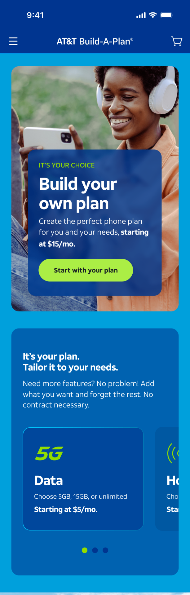
Build-A-Plan homepage

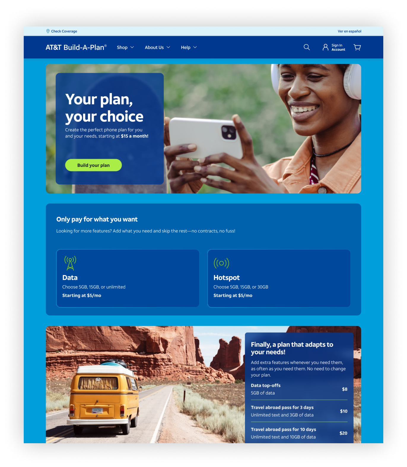
Homepage and entry point to the buy flow

The lander orients customers and ushers them into building their plan.

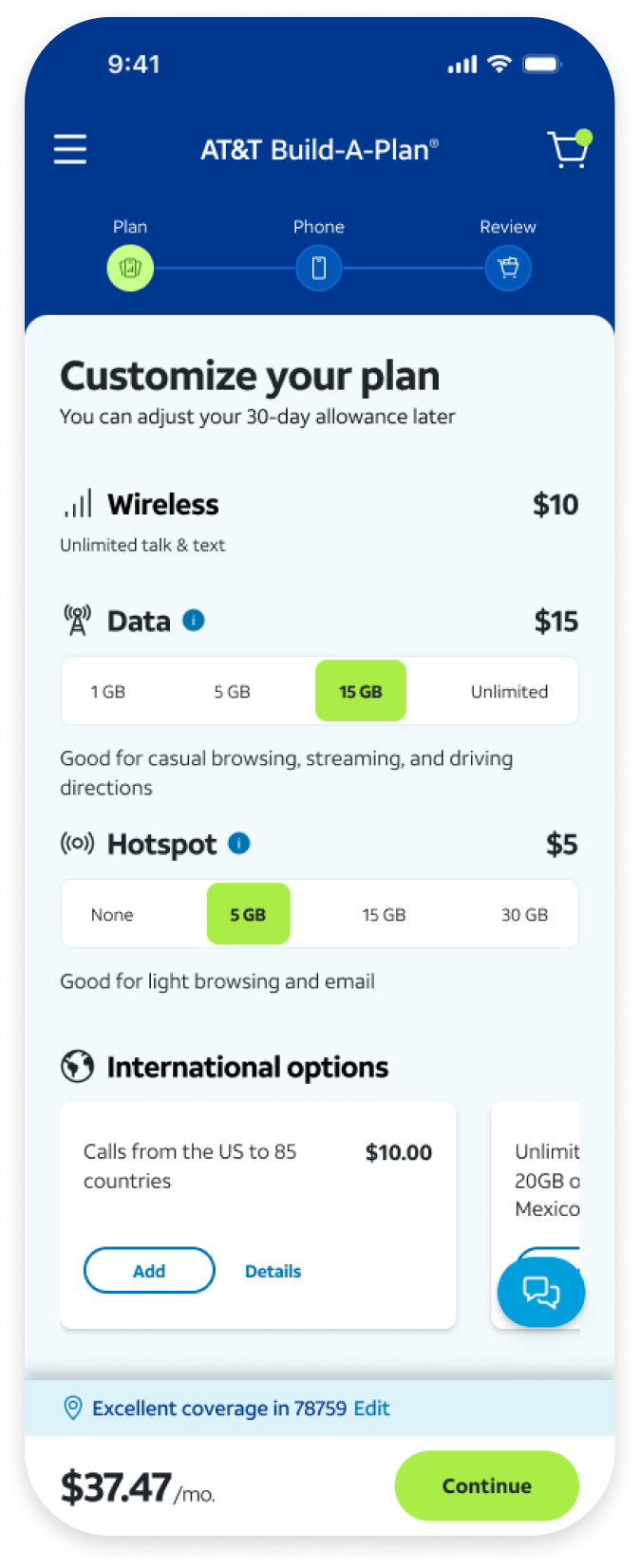
Plan builder

The plan builder displays everything without much scrolling. Descriptions of each data option provide context to help customers better understand each option and make decisions.

Plan builder screen

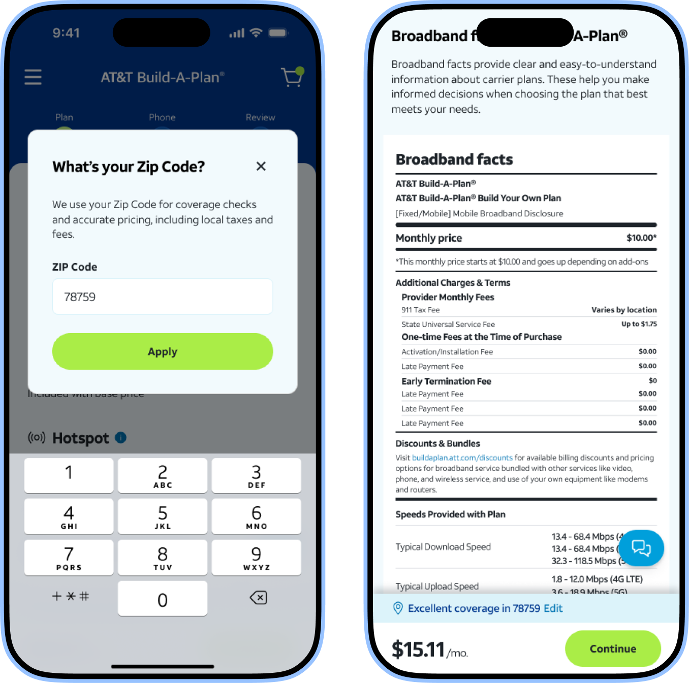
Location & Broadband facts

Progressive disclosure gradually gathers and reveals information without overwhelming the user.

Location capture and broadband facts screens

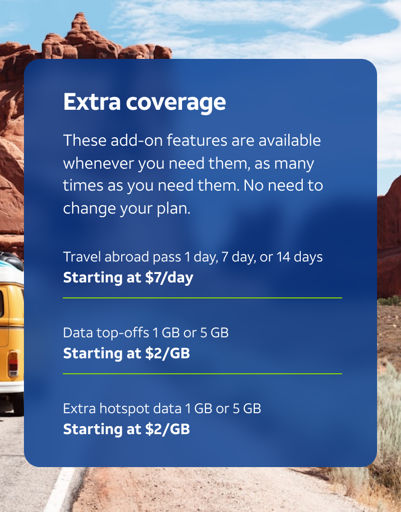
Plan extras

Guidance highlights customers' ability to adjust service without changing their subscription.

Extra coverage screen

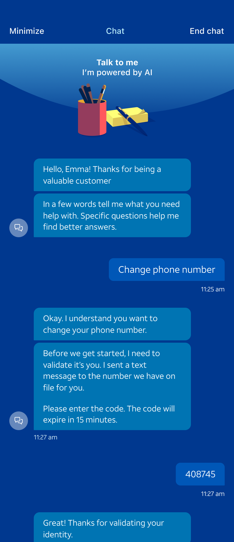
AI chat support

Available during the buy flow and after becoming a Build-A-Plan customer, so help is one tap away at every stage.

AI chat support screen

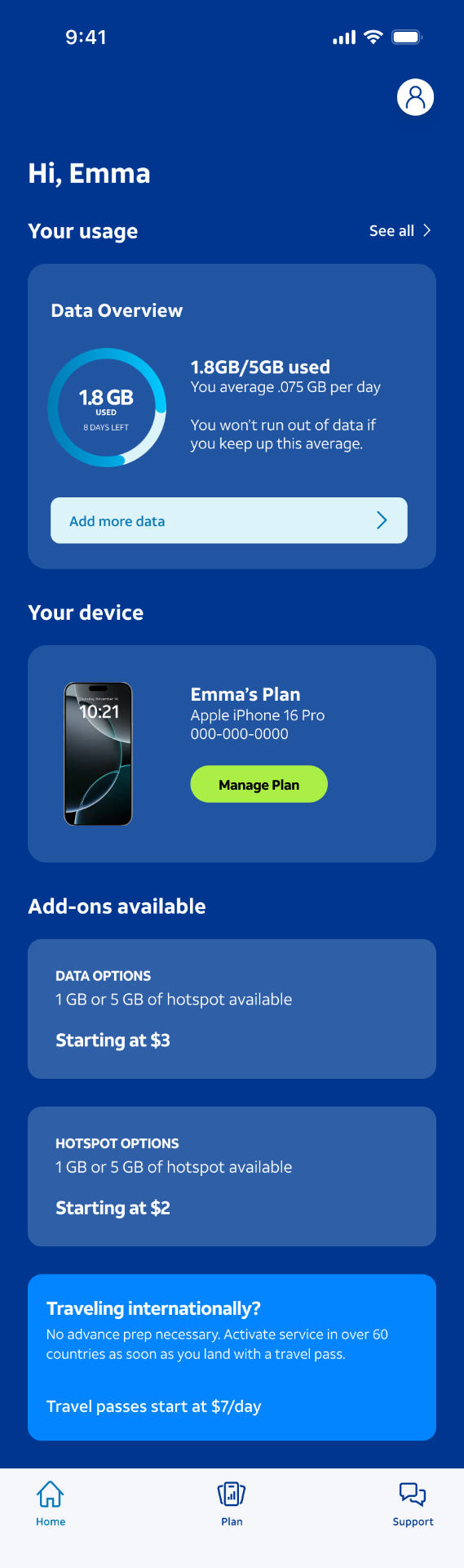
Customer dashboard

See how data is being used, the device registered to the plan, and any add-ons available for purchase.

Customer dashboard screen

Checkout & ID creation

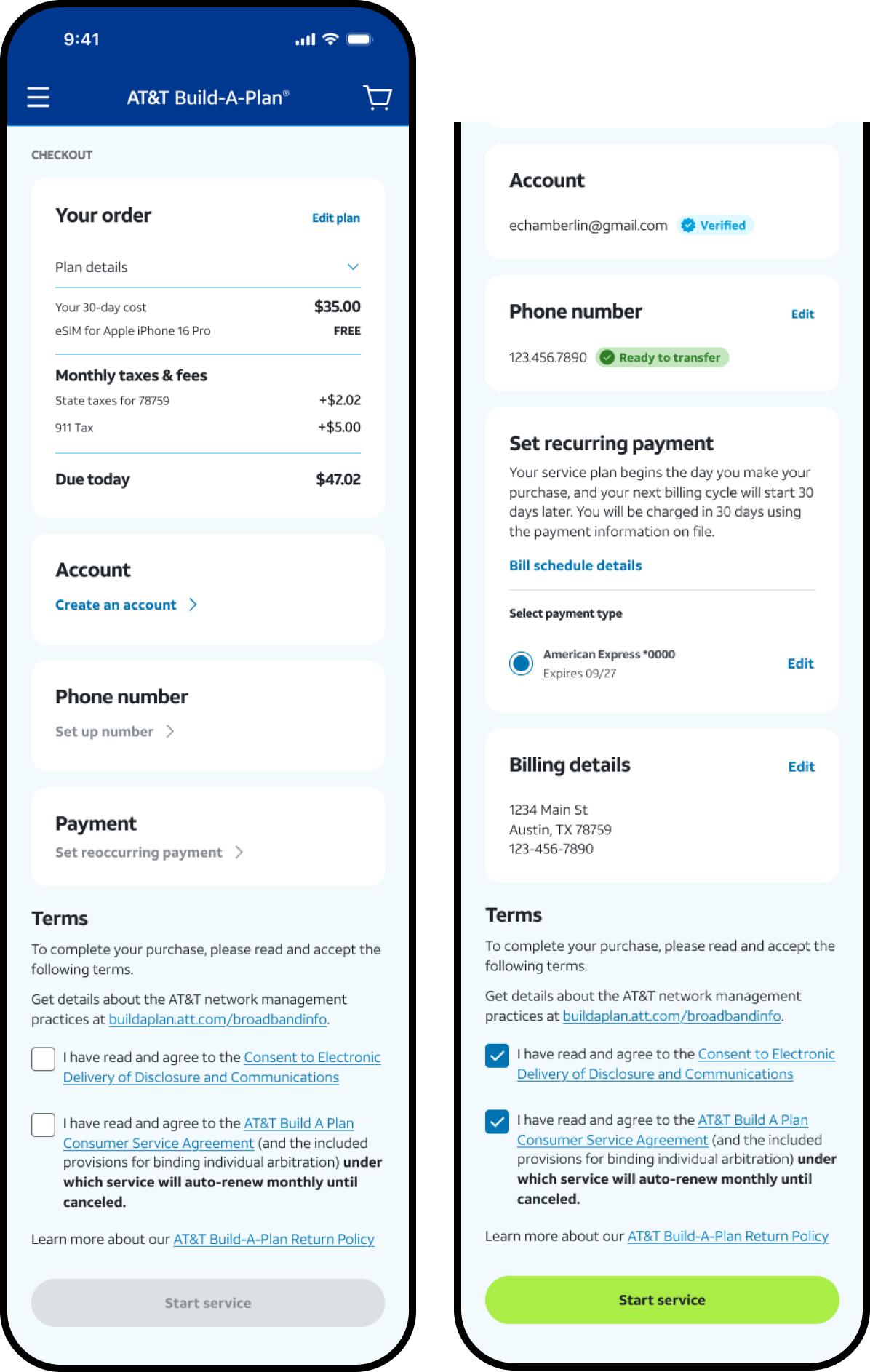
A full breakdown of the monthly payment surfaces early. As customers create or connect an AT&T ID, additional cards unlock to guide them through completion.

Checkout sequence and ID creation screens
Results

Build-A-Plan officially launched on May 27, 2026.

We delivered a research-backed design system, tone framework, and end-to-end customer flow for AT&T's first fully customizable, digital-only wireless offering. Build-A-Plan offered customers an affordable phone plan with the flexibility to add or remove features as their needs evolve.

It flowed very well. I was able to see the breakdown of the pricing, and then I was informed about the app at the end. It guided me well.

VISIBLE BY VERIZON CUSTOMER

Customers want plans that fit their lives. By giving our customers the freedom to tailor their wireless service month to month, we are giving them an affordable way to connect to America's largest wireless network and still control their budget.

EXECUTIVE VICE PRESIDENT & GENERAL MANAGER, AT&T CONSUMER
Plot twists

What launched wasn't quite what we designed.

  • Build-A-Plan was originally going to be endorsed by AT&T, but would have a different platform — even AT&T customers would have to port over. It was set to be coded by a third party and wouldn't live on AT&T.com

  • After we wrapped up the project, leadership brought Build-A-Plan fully in-house. They kept most of the user flow and some of the tone, but they changed the visual elements back to AT&T's traditional branding and design guidelines. You win some, you lose some.

Final thoughts

I'm proud of the work, but I can be honest about the trade-offs.

This one was a doozy. For a moment, we weren't sure Build-A-Plan wouldn't end up on the shelf. While AT&T decided not to fully lean into our visual direction, I'm proud of the work we did and the updated user flow we shipped in some form.

It also gave the team meaningful executive face time through presentations and check-ins. Experiences like those are invaluable at a company as large as AT&T.

My hope is that Build-A-Plan ultimately makes reliable wireless access more accessible to vulnerable and price-sensitive customers. I do worry, though, that it might cannibalize some of our other offerings — something I'll be watching as the product matures.